Let’s do some roleplay
You’re a network admin at a company with offices in twelve countries. You’re responsible for the health and security of everything* running across your organization’s virtual infrastructure. Just business as usual.
So you log into an instance of VMware’s network insight tool. You check the environments. You check the alerts. You check the flows. You move on.

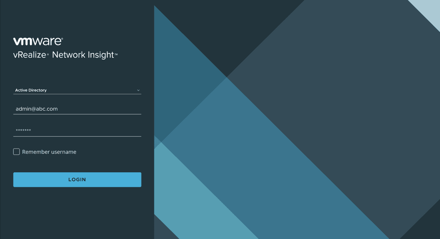
You log into the next instance. Check the environments. Check the alerts. Check the flows.
You log into the next instance. Check the environments. Check the alerts. Check the flows.
You log into the next instance. Check the environments. Check the alerts. Check the flows.
You log into the next instance…
How many tabs do you need?
Fifty instances across twelve countries. Each one monitoring several environments. vCenters, NSX deployments, AWS accounts, Azure subscriptions, physical devices, and more. Each environment running hundreds of nodes and hosts. Each generating alerts, warnings, critical problems. Data flows across all of it numbering in the thousands. Open problems reaching into the hundreds of thousands.
*Everything is doing a lot of heavy lifting. You’re trying to reconstruct a globe from fragments, one tab at a time. You log into the next instance. Just business as usual.
The assignment
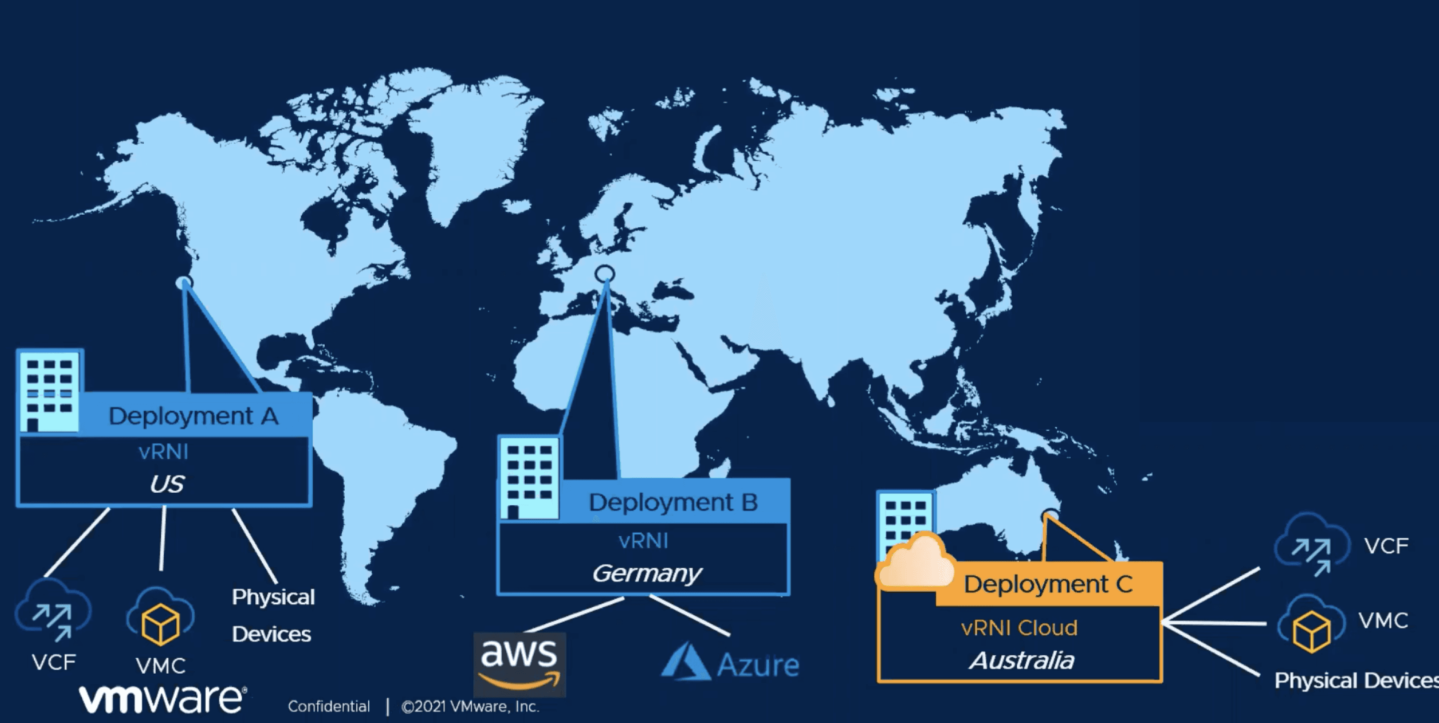
VMware’s vRealize Network Insight was an enterprise tool for monitoring and troubleshooting virtual network infrastructure. Within a single instance, it worked well. But enterprises don’t run single instances. They run dozens or hundreds, and vRNI had no way to connect them.
In 2021, VMware decided to build Federation: a system that links isolated instances and surfaces a combined view of an enterprise’s entire network.
The design challenge
Even with federation as a concept, how do you actually show it to someone?
A network admin opens this dashboard and sees information from fifty instances across twelve countries. Where are they? What are they looking at? What do they do first?
This was a wayfinding problem.
The infrastructure was enormous, with data structured differently across instances. Without clear orientation cues, a unified dashboard is just fifty tabs collapsed into one screen.
One dashboard to rule them all
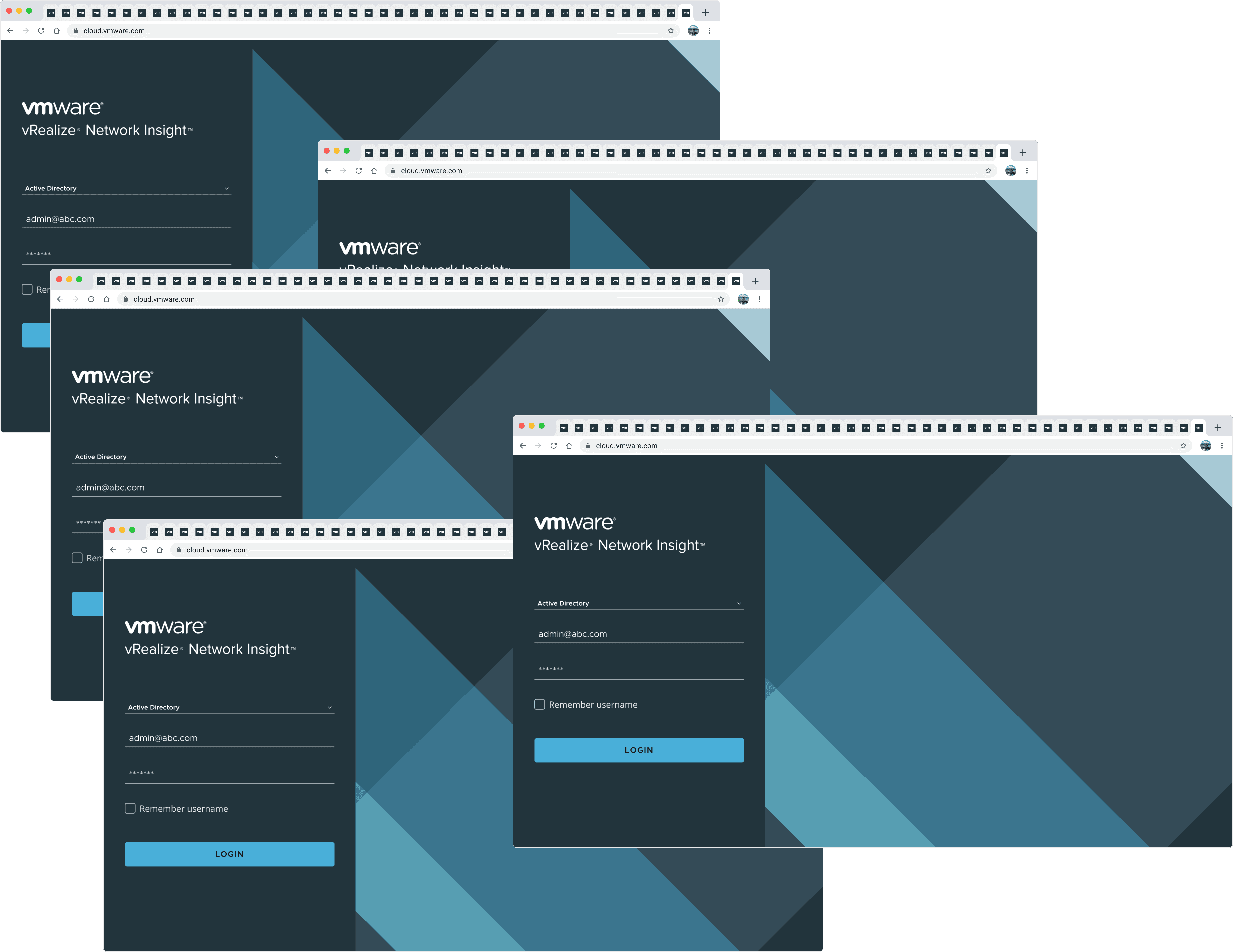
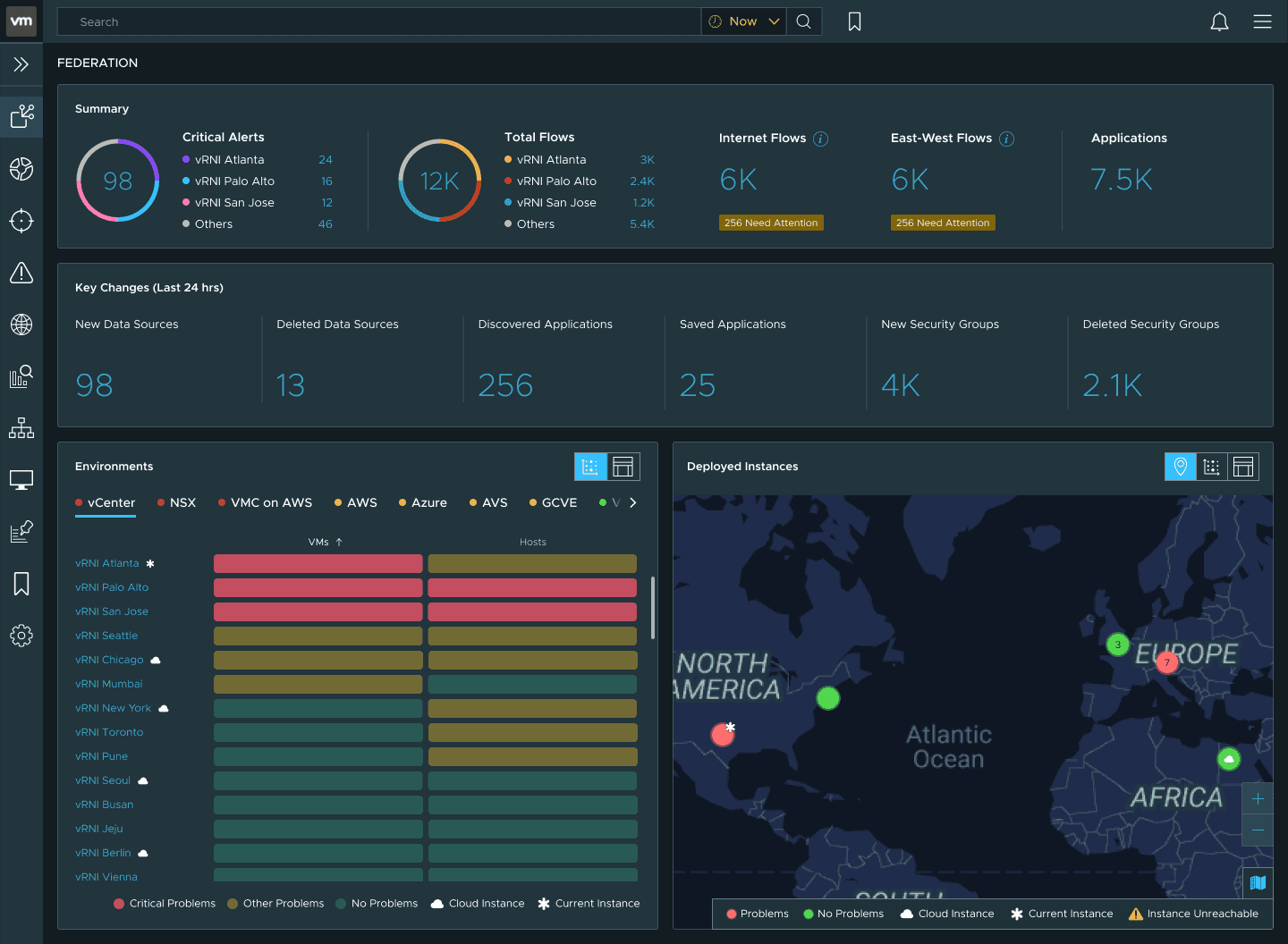
Aggregated health, alerts, and flows across hundreds of environments, thousands of applications, and every instance in your organization network.
Designing the chaos
The data feeding this dashboard is messy by nature. Environments have different data structures, licensing tiers change what’s visible, and feature flags change which widgets appear. Some visualizations are too expensive to compute at this scale.
I personally considered accessibility a non-negotiable from the start.
The design organizes around three questions, in sequence.
What do you notice first?
The dashboard follows the mental model of a network admin triaging their federation, top to bottom.
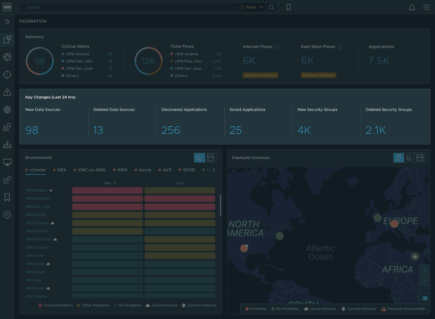
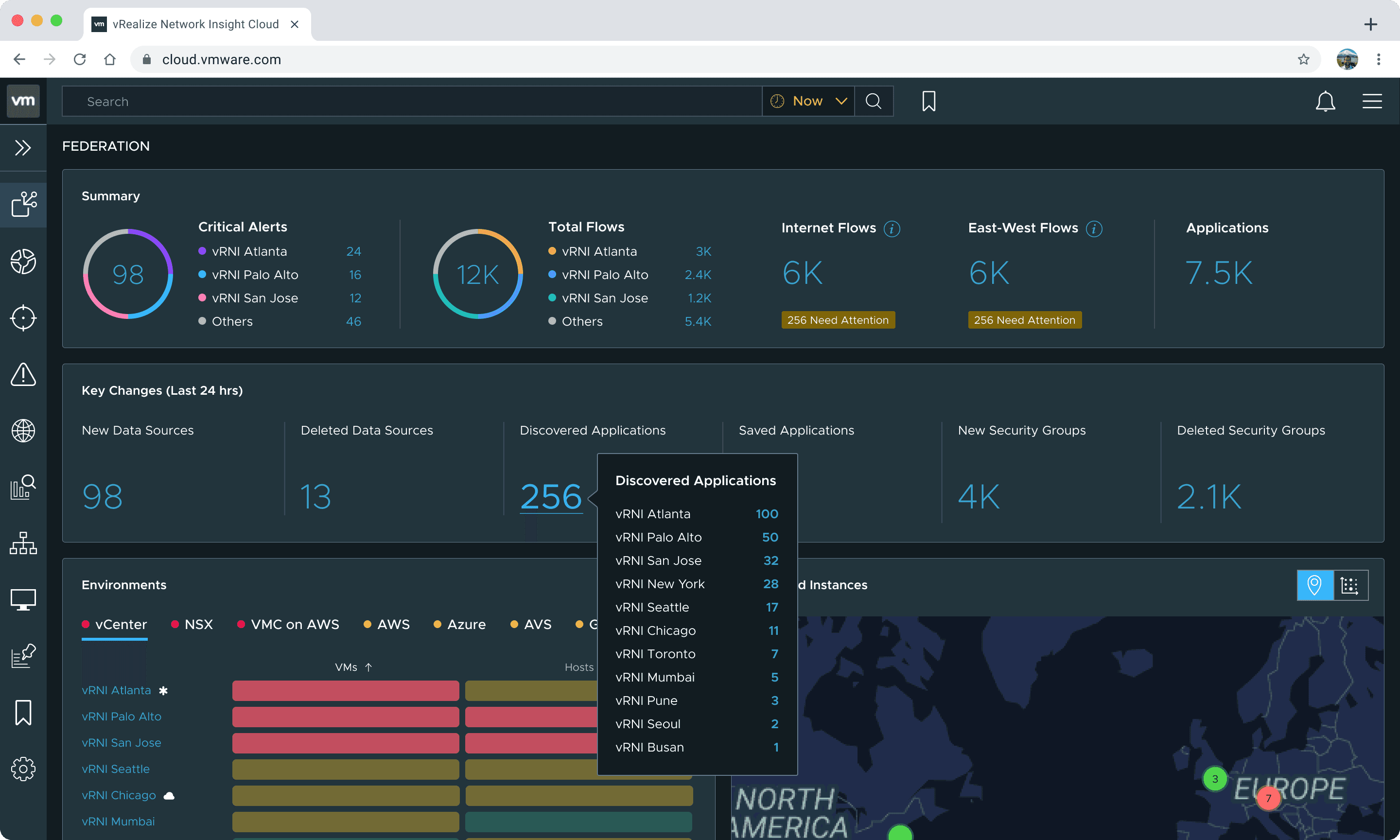
Summary strip
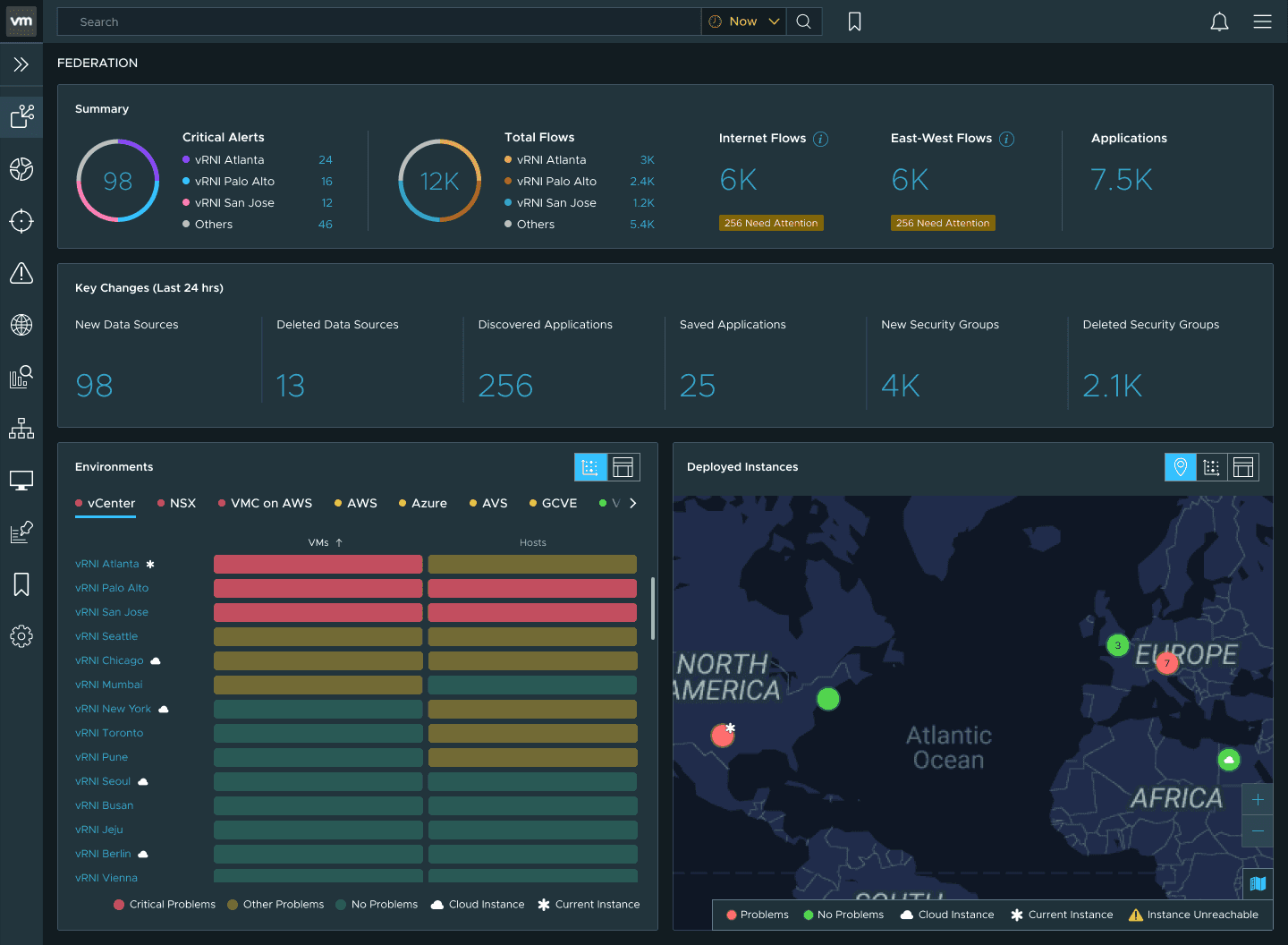
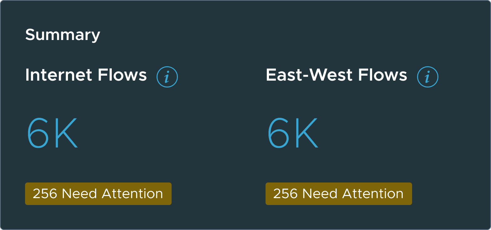
The summary strip answers the first question an admin has: how many critical alerts across the entire federation, and which instances are contributing them.
Next to it, the same breakdown for data flows (north-south between network and internet, east-west within the network) with counts flagged as needing attention, plus total applications.
Before clicking anything, an admin can triage.
Key changes
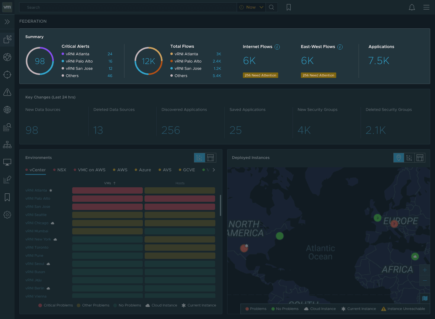
What changed since I last looked?
Key changes from the last 24 hours: new and deleted data sources, discovered applications, security group churn.
Environments
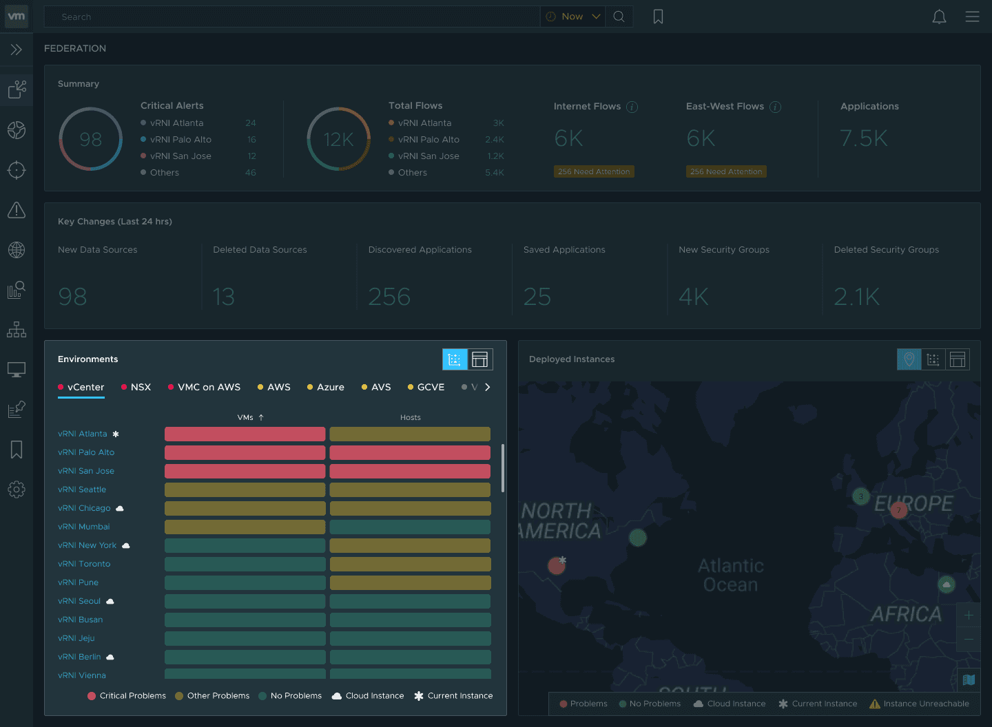
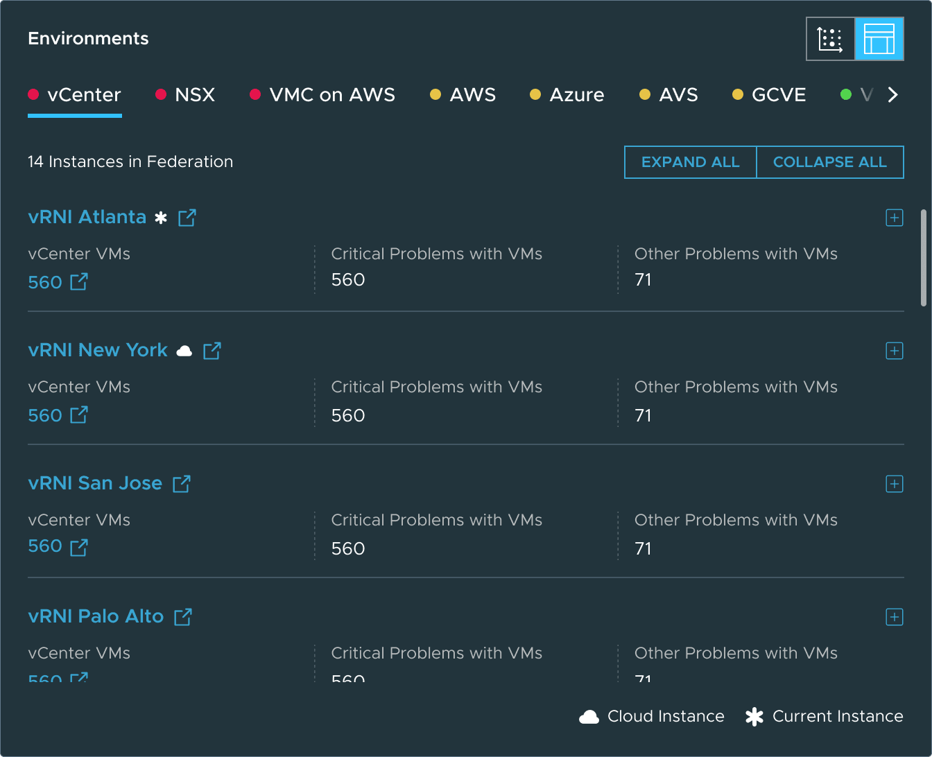
Then the triaging gets specific. The visual matrix was a new pattern I designed for this dashboard beyond the existing design system.
It slices problems by environment type and within each type, shows which instances have the most issues. If one instance has a concentration of AWS problems, the admin knows to contact that instance’s AWS admin.
Deployed instances
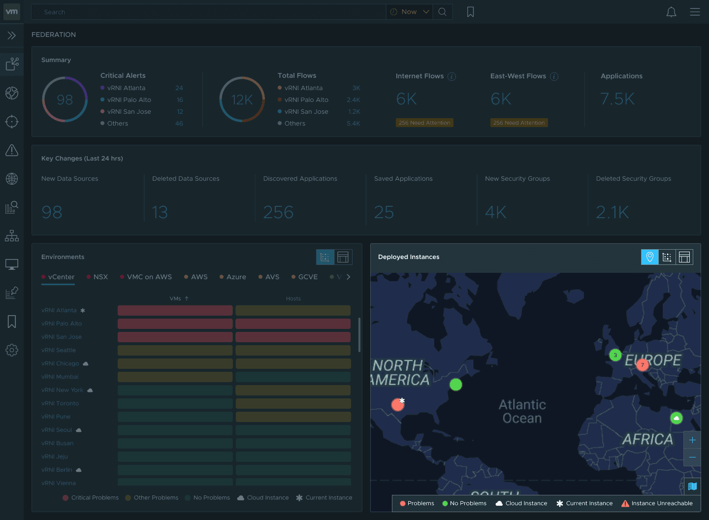
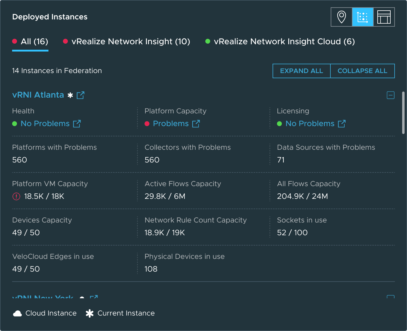
Finally, deployed instances gives a view sliced by instance rather than environment type: where each instance is geographically, its health and capacity, what version of vRNI it’s running, and whether the instance itself has issues.
The map view was also a new component for the product.
Severity
Everything is pre-sorted by severity. Color ramps put critical problems first. An admin scanning for ten seconds can find the worst problem without reading a label.
Progressive disclosure
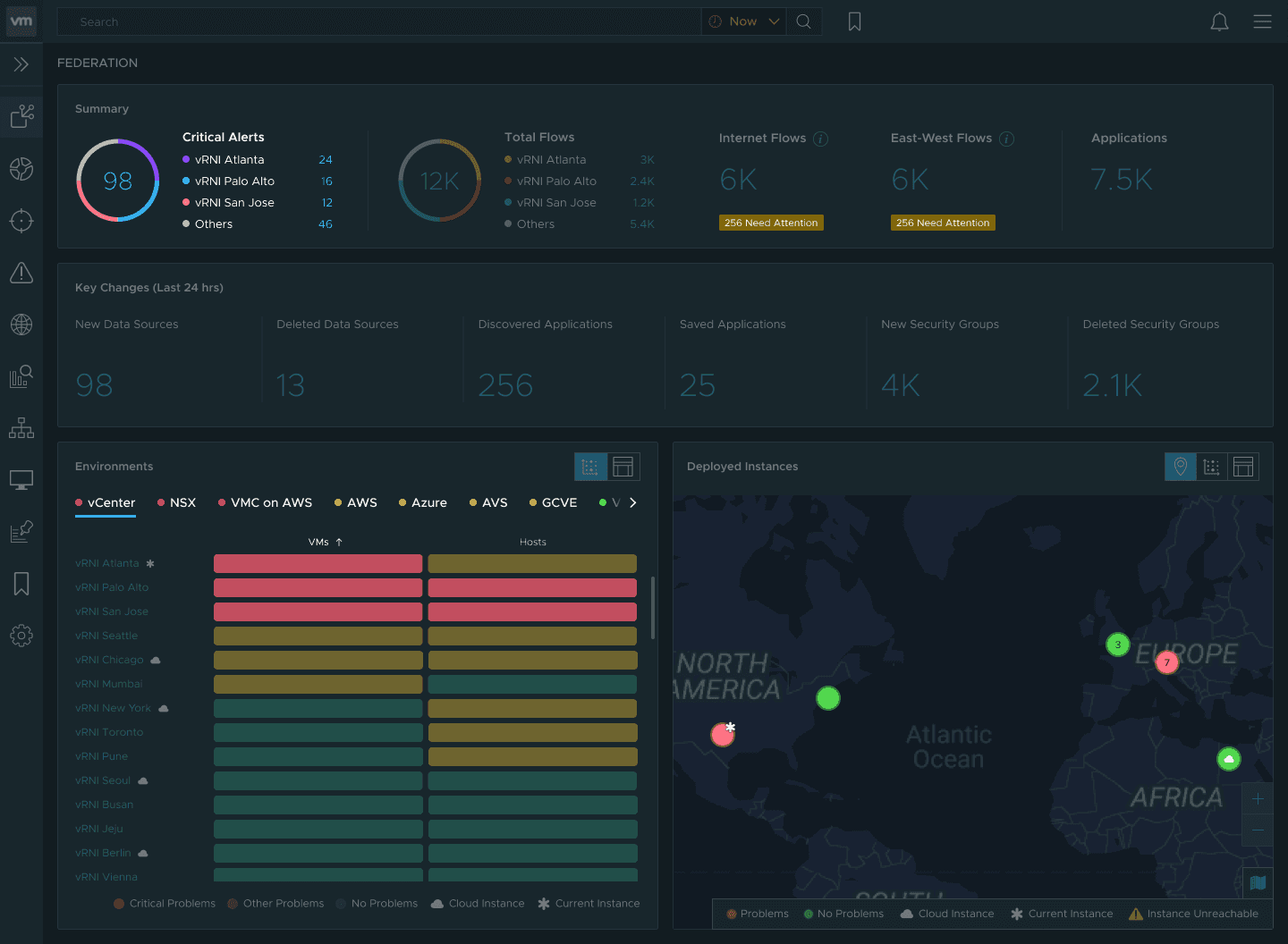
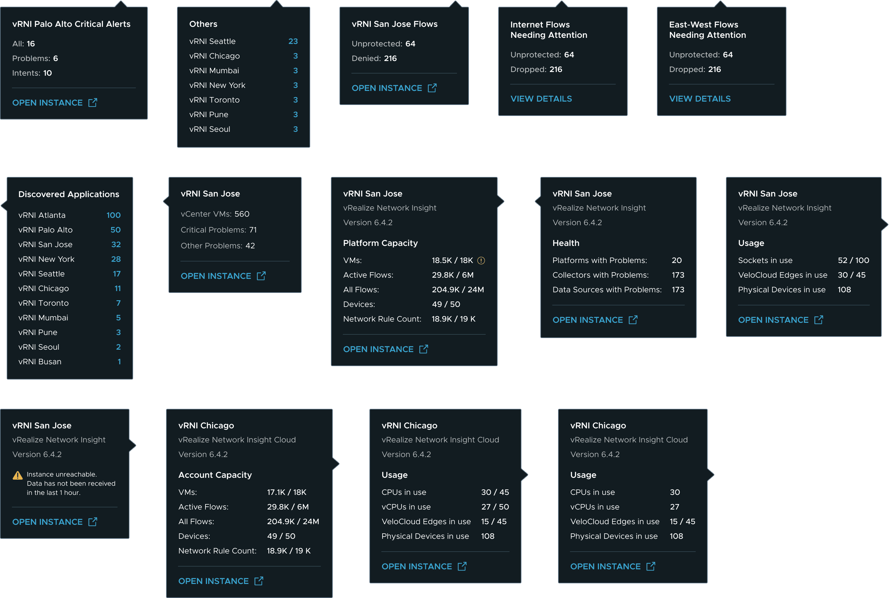
Tooltips progressively disclose detail on hover, so the dashboard stays clean until the admin asks for more.
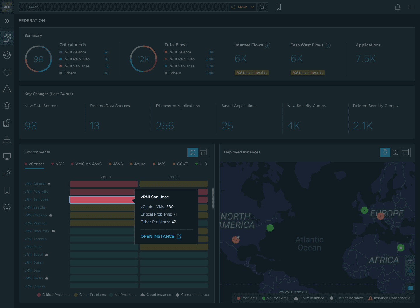
Do you understand what it means?
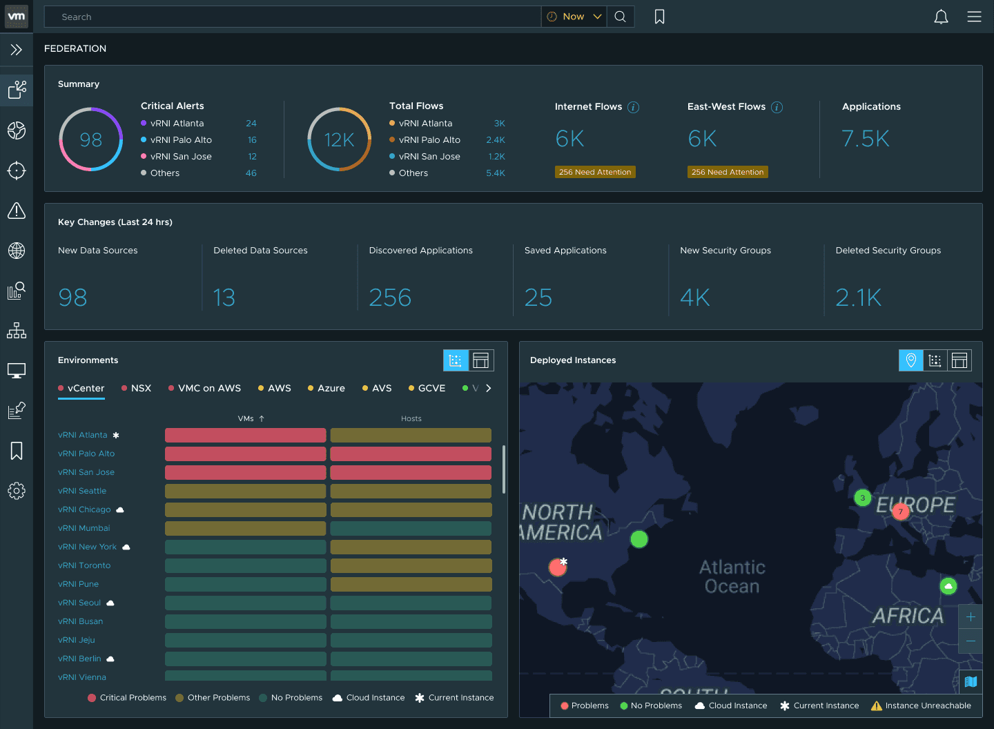
The severity colors in the matrix are deliberately different from the dot indicators used elsewhere.
The standard design system colors are too attention-grabbing for a large matrix. They would make the whole panel feel like an emergency.
Instead, the matrix palette was tuned so each severity level is distinguishable at a glance while keeping the whole thing easy to scan.
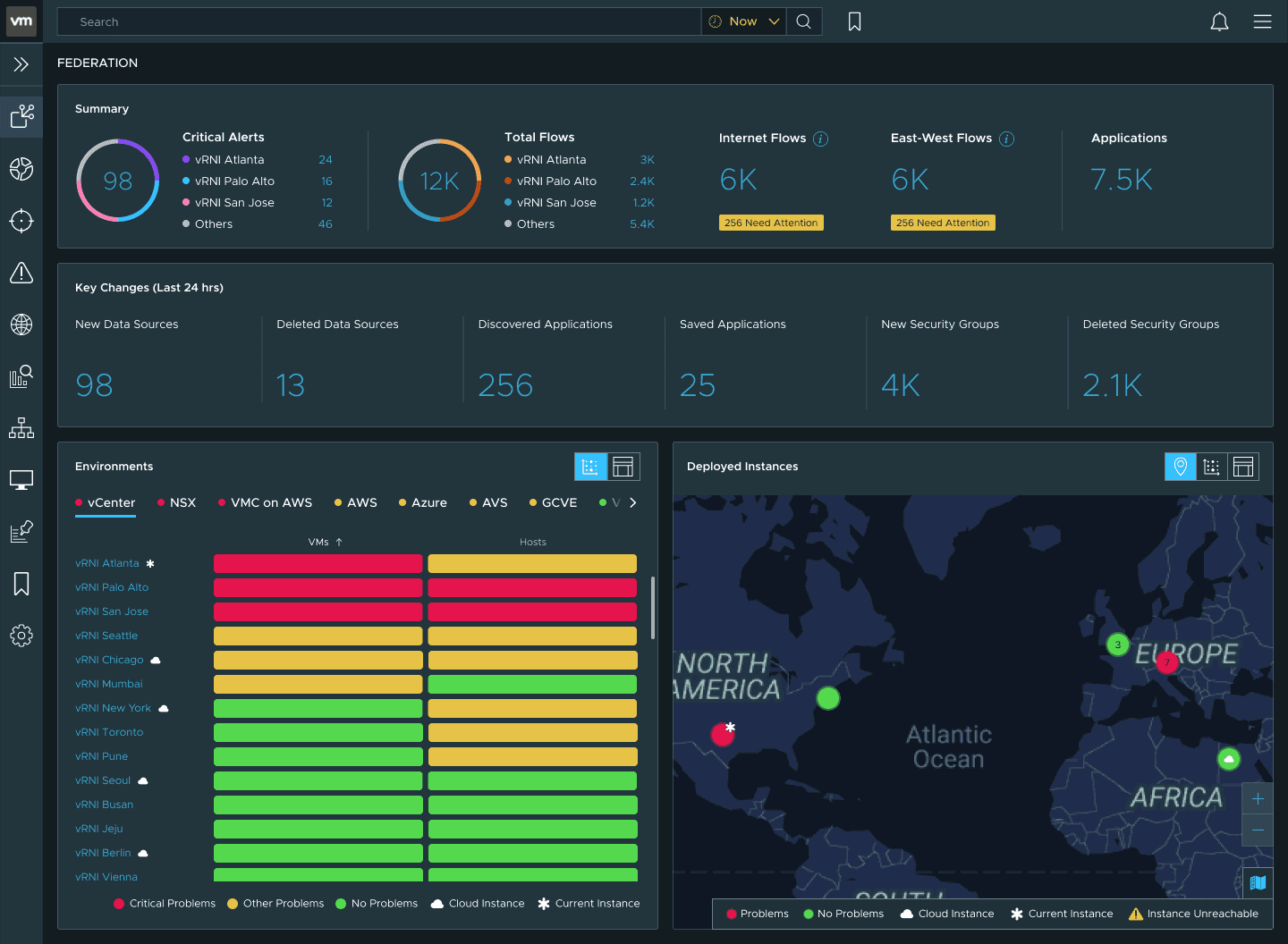
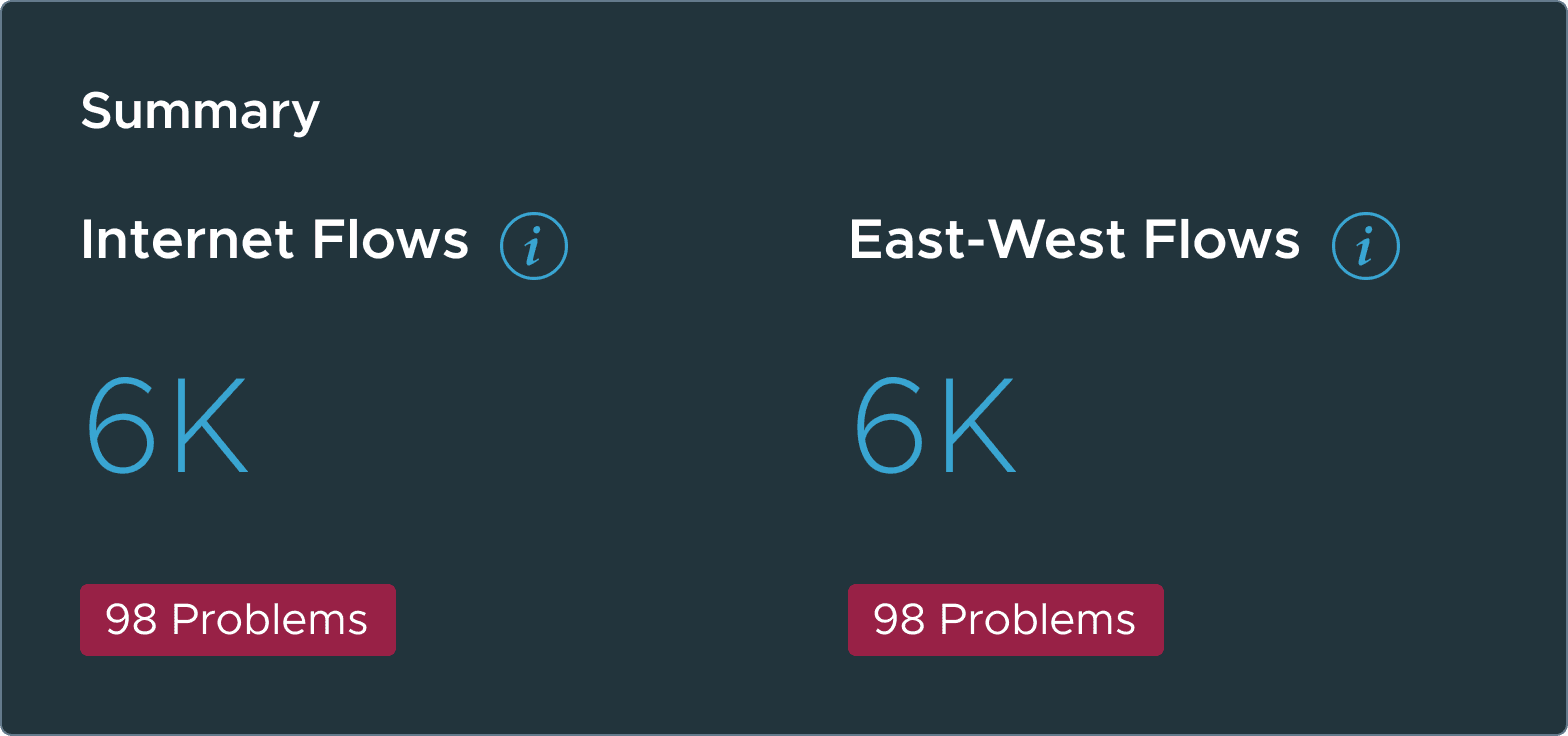
The alert badges on flows are yellow, not red.
In a federation with thousands of flows, at least a few will always need attention. If those badges were red, the dashboard would permanently look like something is broken.
The color red, and the word ‘problem’ is reserved for when something genuinely is one.
Both the environments and deployed instances modules offer alternate views. Environments can switch between matrix and list view. Deployed instances can switch between map, matrix, and list view.
This serves two purposes: different admins have different mental models for parsing the same data, and alternate views are part of the accessibility layer. Screen readers, keyboard navigation, and WCAG 2.1 compliance were built into every view.
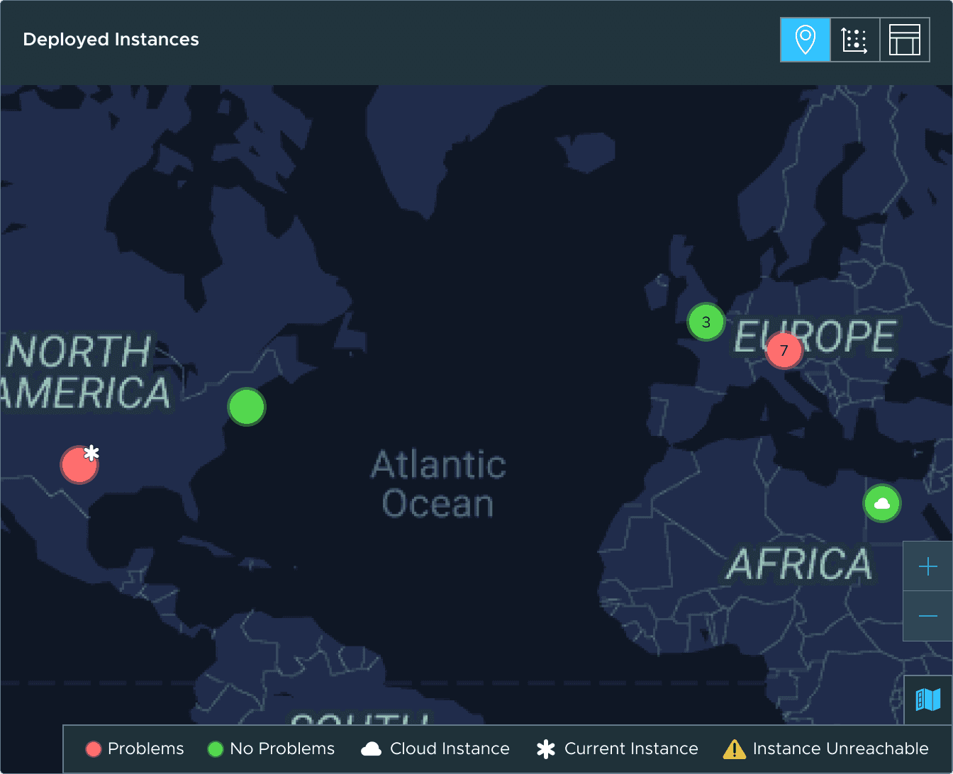
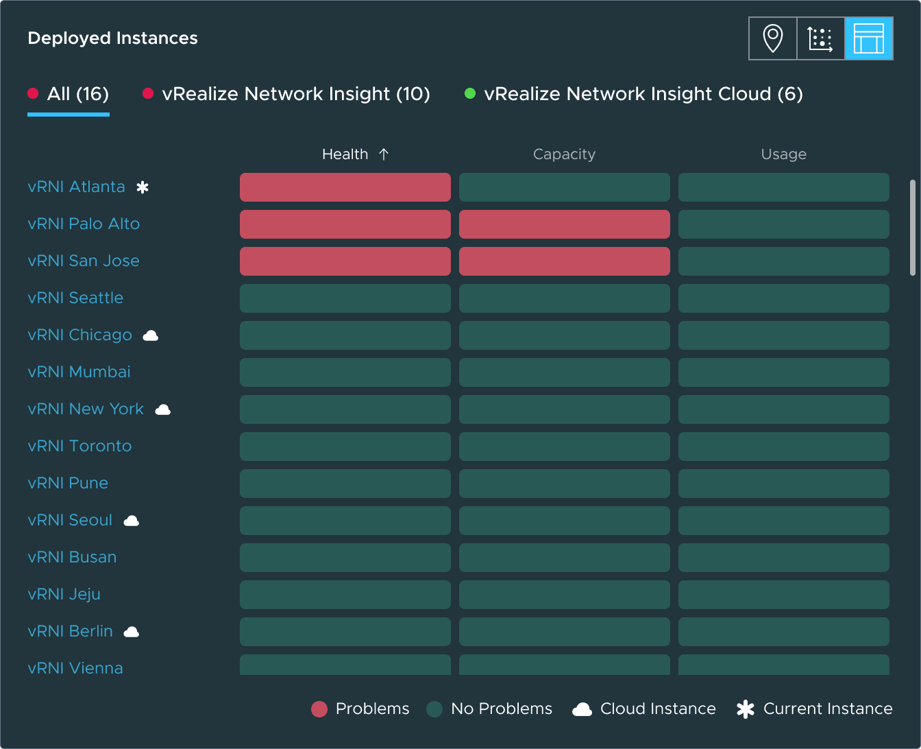
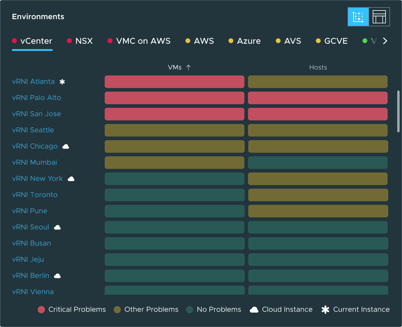
I also designed a modular tooltip system: a single pattern and interaction that serves different purposes in each module.
In the summary, it shows alert breakdowns. In the matrix, device counts. In the map, instance details. Same structure, different content based on context.
Can you get where you need to go?
The dashboard is a map, not a destination. Every interaction leads the admin closer to the specific instance where they can act.
Navigation follows a consistent pattern: see a problem, get detail in context, navigate to the source.
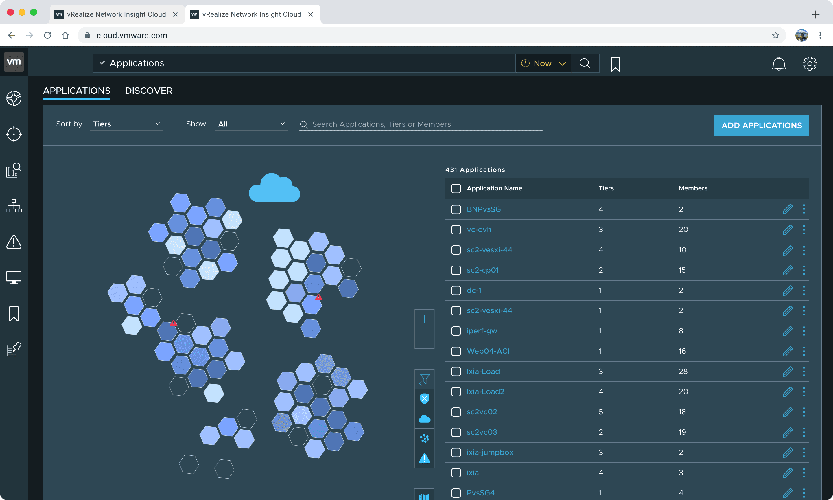
Don’t take my word for it
What teams said after deploying federation.
“We’re seeing incredible visibility into our virtual infrastructure, something we didn’t have before.”
“We are making VMware vRealize Network Insight Cloud IHS Markit’s standard tool for application, network and security visibility and troubleshooting.”
“vRealize Network Insight…helped us learn more about our applications and how to move them.”
Looking back
This project was a crash course in designing within constraints. I dealt with a mature product with entrenched legacy patterns, rigid component systems and a half-yearly release cadence. I had to introduce new patterns while respecting the learning curves that existing users had already built.
Designing for extreme configurability changed how I approach interfaces. When every permutation of licensing, feature flags, and data structure is a valid state, the UI can’t assume anything. It has to hold up under conditions you didn’t specifically design for.
Promo cards
Teaching users the full potential of productivity in Microsoft 365 Mobile
view project