This is a container div
This page is basically wrapping around a Figma file. If you scroll, you’ll find the full case study in its natural habitat, complete with interactions and details I probably didn’t need to include.
Presentation
Note: Full-screen experience recommended.
Click anywhere in the deck or use arrow keys to navigate.
Press R to reset prototype.
Impact
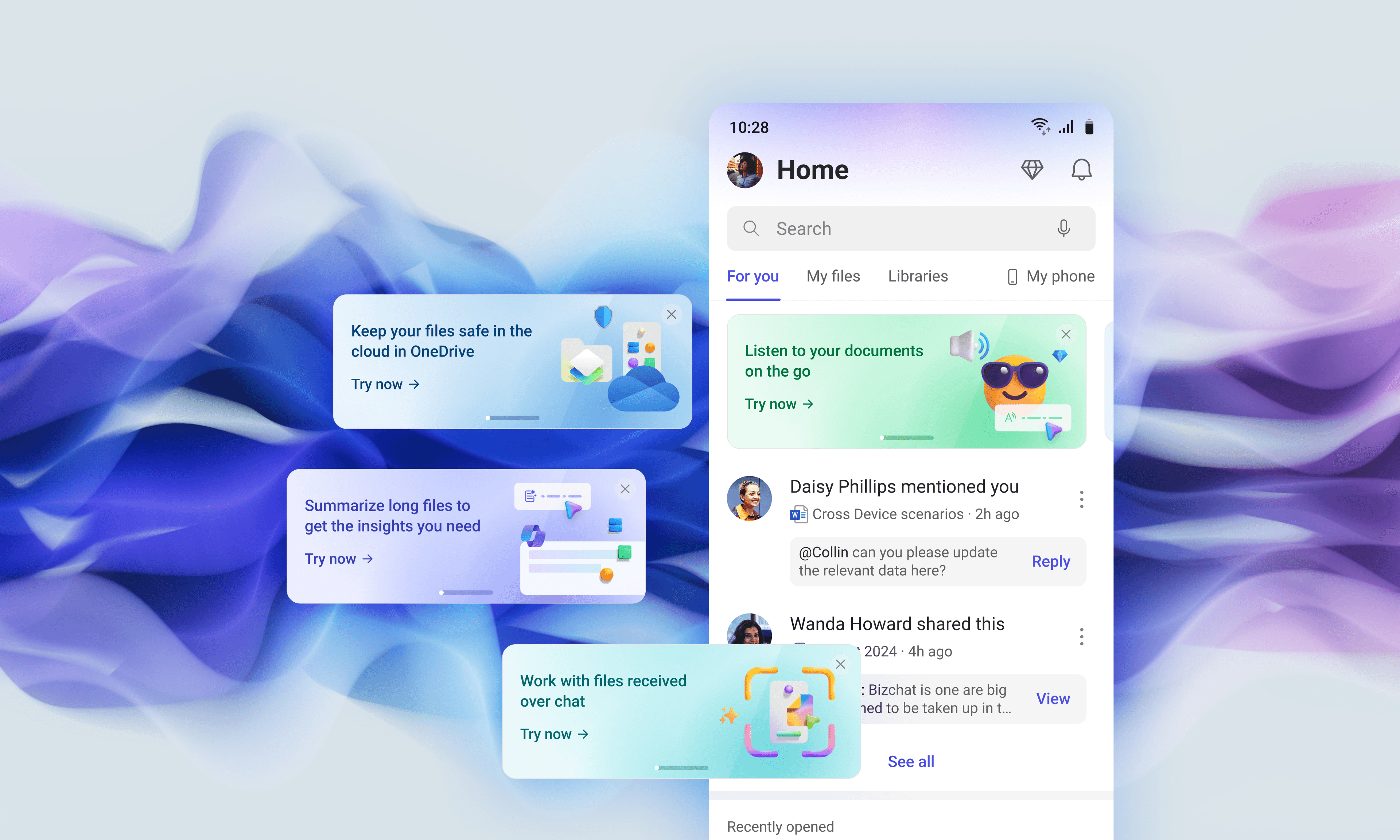
A pretty card is irrelevant if it doesn’t change behavior. In our pilot and rollout, the promo cards consistently turned curiosity into increased launches and repeat usage.
1 in 4 people tried a featured capability.
Nearly half of Designer opens in the pilot.
Sharp increase of usage for promoted flows.
A small lesson I keep reusing
Discovery only works when it feels earned. This project was a reminder that the best growth surfaces are the ones that avoid 'marketing' and feel natural within the product.
Relevant home pages
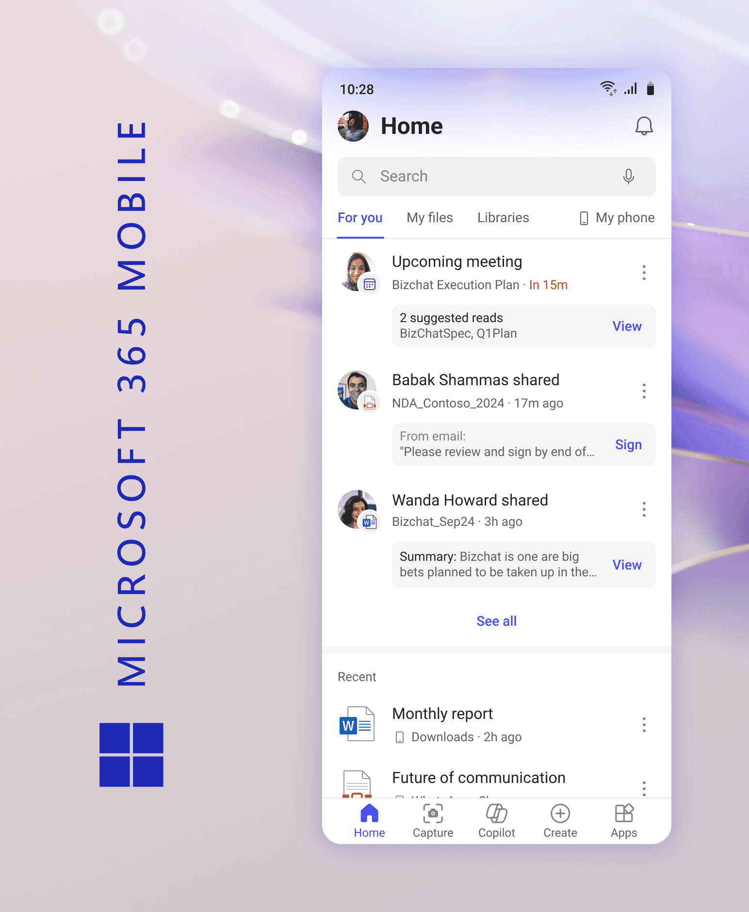
Redesigning what 128 million people see when they open Microsoft 365 Mobile
view project